How Do Colors Affect Your Mood in Home Interior Design?

Colors play a powerful role in shaping the atmosphere of your home and influencing your emotions. The shades you choose for your walls, furniture, and décor can uplift, calm, energize, or even create a sense of warmth and comfort.
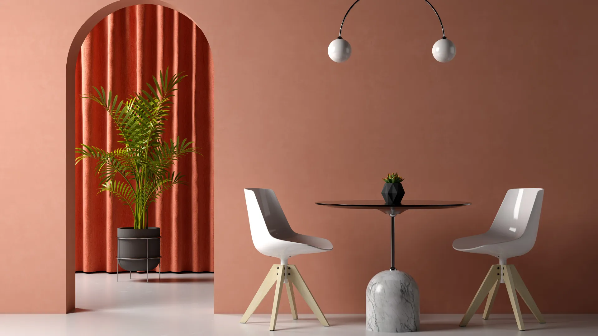
For instance, soft blues and greens are known for their calming effect, making them ideal for bedrooms or relaxation areas. Warm tones like yellows and oranges bring cheerfulness and vibrancy, perfect for dining spaces or living rooms where families gather. On the other hand, neutral shades such as beige, grey, or white create a timeless backdrop that promotes balance and sophistication. Meanwhile, bold colors like red or deep purple can add drama and passion but work best as accents rather than dominant shades.
At D2M interior, we focus on understanding how color psychology aligns with your lifestyle and personality. Whether you want a serene retreat, an energetic social hub, or a cozy family space, the right color palette can set the tone for every corner of your home.
Ultimately, colors are not just about style—they are about how you feel in your space every single day.
1. The Psychology of Colors in Interiors
Color psychology suggests that different colors stimulate different emotions. While warm colors often feel energizing and cozy, cool colors bring calmness and serenity. Neutral shades create balance, while bold hues evoke excitement or drama. When designing a home, understanding these effects helps you select palettes that enhance comfort, functionality, and mood. Professional guidance from Interior Designers in Chennai for Homes ensures that your chosen colors not only reflect your personality but also complement the architecture, lighting, and layout of your space for a harmonious atmosphere.
2. Blue: The Calm and Peaceful Choice
Blue is often associated with tranquility and relaxation. Lighter shades of blue work beautifully in bedrooms and bathrooms, creating a spa-like atmosphere. Navy and darker blues bring sophistication and stability, perfect for living rooms or home offices. However, too much dark blue may feel cold, so balance it with warm accents.
3. Green: The Refreshing Natural Vibe
Green represents balance, nature, and renewal. It’s one of the most calming and restful colors for the eyes. Perfect for living rooms, kitchens, and even study areas, green brings freshness and harmony into interiors. Olive green and sage are trending tones that add elegance while keeping the space grounded.

4. Yellow: The Energizer
Yellow is the color of happiness, positivity, and energy. Soft pastel yellows brighten small spaces, making them feel cheerful. Bold mustard or golden shades add a sense of luxury to dining rooms or halls. However, overusing bright yellow can cause restlessness, so it’s best used as an accent.
5. Red: Passionate and Bold
Red is one of the most intense colors in interior design. It symbolizes passion, love, and energy. A red accent wall in a dining room encourages conversation and appetite. Burgundy or wine shades bring sophistication, while brighter reds are ideal for bold statement corners. Too much red, however, can feel overwhelming, so moderation is key.
Also read, “Types Paint Sheens or Paint Finishes”
6. White: Clean and Minimalist
White embodies purity, simplicity, and timeless elegance in home interiors. It creates a sense of openness, making rooms feel larger and brighter. Perfect for minimalist designs, white allows furniture, textures, and décor to stand out effortlessly. It pairs beautifully with natural wood, soft fabrics, or metallic accents, offering both warmth and sophistication. For those seeking a clutter-free, serene ambiance, white remains the ultimate choice for a clean, modern, and refreshing home.
7. Black: Elegance with Drama
Black adds luxury, depth, and boldness when used thoughtfully. While painting entire rooms black may feel oppressive, black accents, furniture, or trims add sophistication. Matte black fixtures are a modern trend, giving bathrooms and kitchens a stylish edge.
8. Neutral Shades: Timeless Versatility
Beige, gray, taupe, and earthy tones create versatile backdrops that allow furniture and décor to shine. They evoke stability, warmth, and comfort while blending seamlessly with bolder accents. Neutrals are excellent for open-plan layouts where balance is essential.
9. Pink and Pastels: Softness and Creativity
Pink brings charm, romance, and creativity. Soft blush tones are perfect for bedrooms and living rooms, adding a gentle, soothing atmosphere. Brighter pinks like fuchsia energize small corners. Pastels, in general, bring a dreamy and playful mood to interiors, suitable for kids’ rooms or modern eclectic homes.
10. Orange: Warmth and Vitality
Orange is a lively, vibrant shade that combines the energy of red and the cheerfulness of yellow. It stimulates activity and social interaction, making it ideal for living rooms and workout spaces. Burnt orange or terracotta shades bring coziness to rustic or bohemian interiors.
11. Purple: Luxury and Spirituality
Purple has long been associated with royalty, creativity, and spirituality. Lighter lilacs bring a calming vibe, while deep purples like plum or eggplant add drama and richness. Purple works beautifully in bedrooms, meditation areas, or statement walls.
12. Brown and Earth Tones: Comfort and Grounding
Brown creates a warm, grounded, and secure atmosphere. Wooden finishes, leather accents, or earthy wall tones make interiors feel cozy and connected to nature. Earth tones pair well with both bold and neutral shades, making them highly versatile.
13. Multicolor Palettes: Energy and Playfulness
Sometimes, it’s not about one color but how different shades interact. Combining multiple colors in the right balance can create vibrancy and joy. For example, a hall with a mix of teal, mustard, and gray feels playful yet sophisticated. A pastel combination adds softness and whimsy.
14. Using Color for Functionality
Different rooms serve different purposes, and color choices should align with functionality:
- Living Rooms: Warm and inviting shades like beige, green, or soft blue.
- Bedrooms: Calming tones such as lavender, light blue, or neutrals.
- Kitchens & Dining: Energizing hues like yellow, orange, or red accents.
- Study or Office: Focus-inducing colors like green, gray, or muted blue.
Color in interior design is more than just decoration—it’s a powerful tool that defines purpose and enhances functionality. By assigning colors strategically, you can guide movement, highlight focal points, and create distinct zones within a home. For example, bright hues like yellow or orange can energize kitchens and workspaces, while cool shades such as blue or green promote calmness in bedrooms or study areas. Neutrals provide balance, making them ideal backdrops for multi-functional living rooms. Even accent walls or contrasting tones can direct attention toward specific areas like reading nooks or dining spaces.
15. Balance and Lighting
According to the Best Interior Designer in Chennai, the effect of color also depends on lighting. Natural daylight enhances true tones, while artificial lighting can alter shades. For example, warm lights intensify yellows and reds, while cool lights emphasize blues and whites. Always test colors in different lighting conditions before finalizing. Strategic use of lighting ensures that the chosen palette delivers the exact mood and atmosphere intended for each space.
Conclusion
Colors shape the soul of your home. They can calm, energize, inspire, or even heal—depending on how you use them. By carefully selecting colors that align with your mood and lifestyle, you can design interiors that not only look beautiful but also feel emotionally supportive. After all, your home should be a sanctuary where colors embrace you with warmth, positivity, and harmony.With expert guidance from D2M interior, you can design a home where every shade works in harmony with your lifestyle.


